
Brutalism in Web Design

The Raw, Unfiltered Aesthetic of Brutalist Web Design
Brutalism in web design is a rebellion against the polished, ultra-minimalist interfaces that have dominated digital spaces for years. Characterized by stark typography, clashing colors, raw HTML aesthetics, and grid-defying layouts, brutalism strips away decorative elements in favor of pure functionality and anti-design principles. But is it just a passing trend, or does it hold long-term value for brands and businesses?
What Defines Brutalist Web Design?
Brutalism in web design borrows from the architectural movement of the same name, known for its raw concrete structures and utilitarian feel. Web brutalism rejects conventional UX rules in favor of stark, almost chaotic layouts.
Core Characteristics of Brutalist Websites:
↳ Unpolished Aesthetic – Raw HTML, default system fonts, no smooth gradients or soft shadows.
↳ High-Contrast Color Schemes – Clashing, sometimes painful-to-look-at color combinations.
↳ Grid-Breaking Layouts – Overlapping elements, asymmetry, and unpredictable visual flow.
↳ Minimal to No UX Comforts – Few affordances, unconventional navigation, and unexpected interactions.
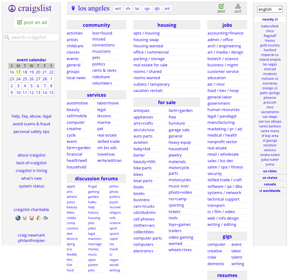
Example: Craigslist remains one of the longest-standing examples of brutalist web design, prioritizing speed and efficiency over aesthetics.
Why Brands Are Experimenting with Brutalist Web Design
While brutalism might seem like a rejection of usability, some brands are embracing it to stand out in an era where most websites look alike.
Key Reasons Brands Use Brutalism:
↳ Authenticity & Rawness – Strips away corporate polish, making brands feel more direct and unfiltered.
↳ Memorability & Differentiation – Breaks from the grid-like homogeneity of modern web design.
↳ Nostalgia & Web 1.0 Appeal – Appeals to early internet aesthetics and indie culture.
↳ Faster Load Times – Minimalist, unstyled HTML often loads significantly faster than complex, JavaScript-heavy designs.
Example: Bloomberg’s 2016 redesign leaned into brutalist aesthetics, sparking controversy but driving engagement through its raw, editorial-first layout.

The Functional Benefits of Brutalism in UX
While brutalist websites appear chaotic, they offer certain advantages from a functional perspective.
Brutalism’s UX Strengths:
↳ High Contrast Improves Readability – Brutalist sites often meet accessibility standards through strong contrast.
↳ Performance & Speed Optimization – Minimal styling and lack of heavy JS improve load times and mobile performance.
↳ User Engagement Through Disruption – Unconventional layouts force users to explore content more deliberately.
↳ Strong Identity & Brand Recall – Visitors remember brands that break away from expected UI norms.
Example: The brutalist website of The Drudge Report remains one of the highest-trafficked news sites despite its outdated, raw layout.

The Downsides: When Brutalism Fails in UX
Brutalism’s rejection of conventional UX and accessibility norms can backfire if not strategically applied.
Common Pitfalls of Brutalist Web Design:
↳ Overwhelming Visual Chaos – If taken too far, the experience becomes frustrating rather than engaging.
↳ Navigation Friction – Unusual layouts often lead to usability confusion and increased bounce rates.
↳ Not Business-Friendly – Most eCommerce, SaaS, and enterprise sites rely on polished UI for trust and credibility.
↳ Accessibility Issues – High-contrast elements and erratic layouts can make interfaces inaccessible to users with visual impairments.
Example: The brutalist approach of Yale’s School of Art website has received both praise and criticism for its unique but difficult-to-navigate design.

Brutalism vs. Modern Minimalism: Finding the Balance
Brutalism doesn’t have to be an all-or-nothing design choice. Many brands successfully blend brutalist elements with modern UI principles for a best-of-both-worlds approach.
Neo-Brutalism: A Hybrid Approach
↳ Bold, High-Contrast Typography – Without sacrificing readability.
↳ Raw Aesthetic with UX Refinements – Preserves brutalism’s edge while keeping interactions intuitive.
↳ Minimalist Layouts with Brutalist Visual Cues – Balances structure with disruptive design elements.
↳ Performance-Driven Brutalism – Using its speed benefits while maintaining usability.
Example: Figma FigJam’s product page integrates brutalist inspiration with a modern, intuitive UI.

Conclusion: Is Brutalism Here to Stay..?
Brutalism is a response to over-designed, cookie-cutter web experiences. While it’s unlikely to become the dominant design language, it will continue to shape digital design as a counterpoint to modern minimalism. The future likely lies in neo-brutalism, where brands embrace bold, raw aesthetics without sacrificing usability and accessibility.
Final Call to Action: Brands looking to differentiate themselves should explore brutalist elements strategically. Whether as a full design philosophy or an accent to modern interfaces, brutalism offers a powerful tool for creating memorable, high-impact digital experiences.